5 Curated Color Palettes For Your Next Block Print Workshop
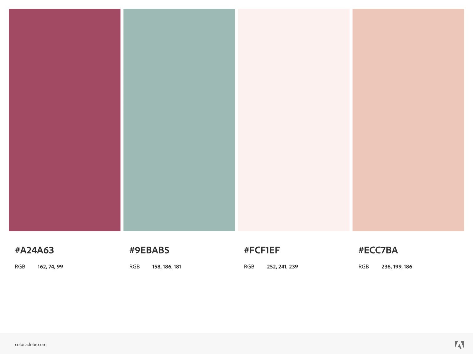
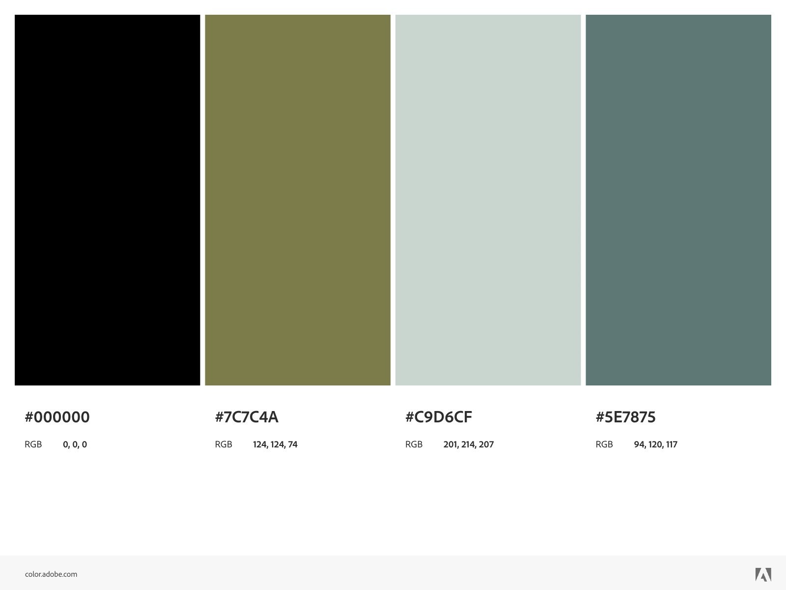
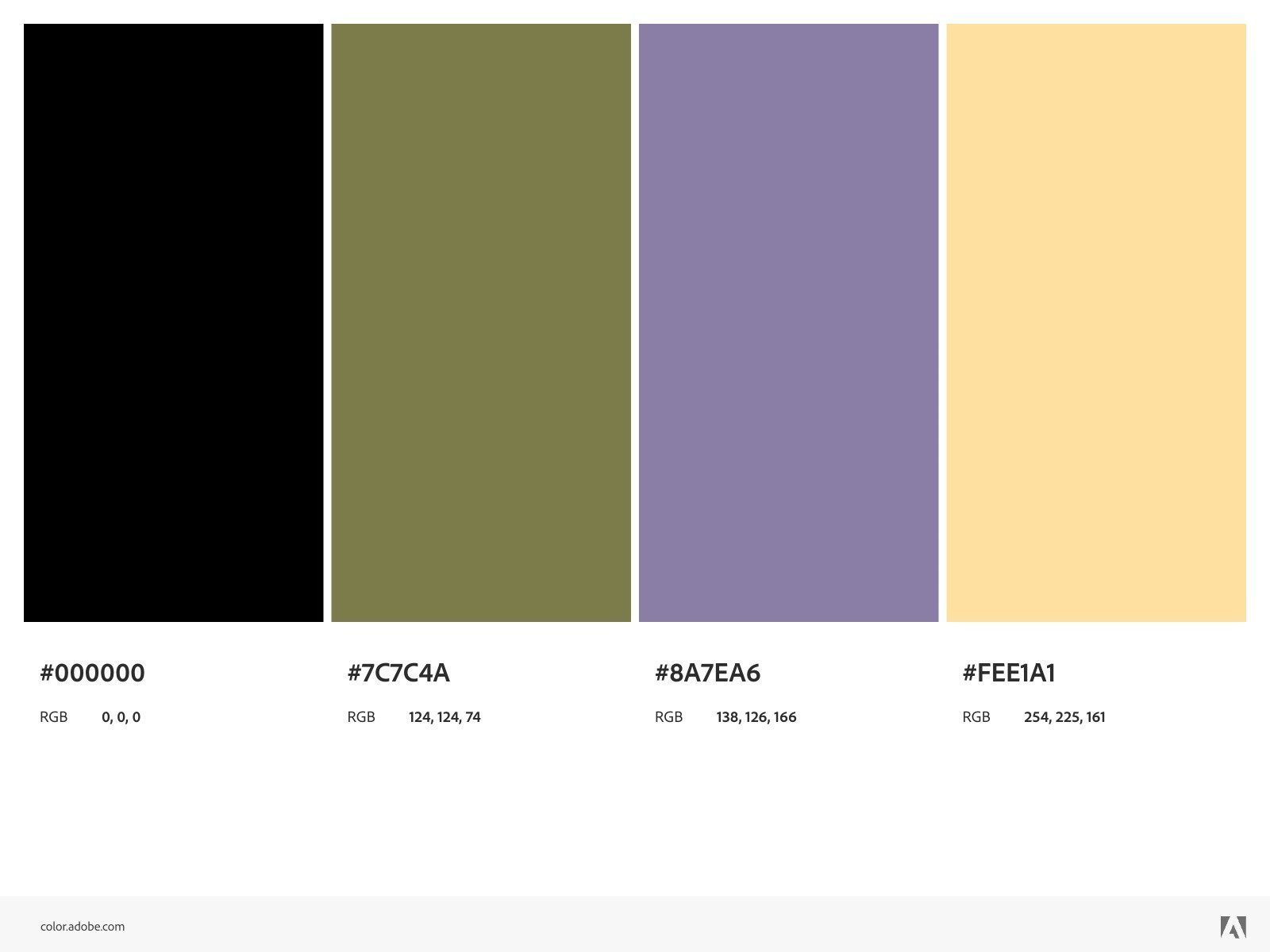
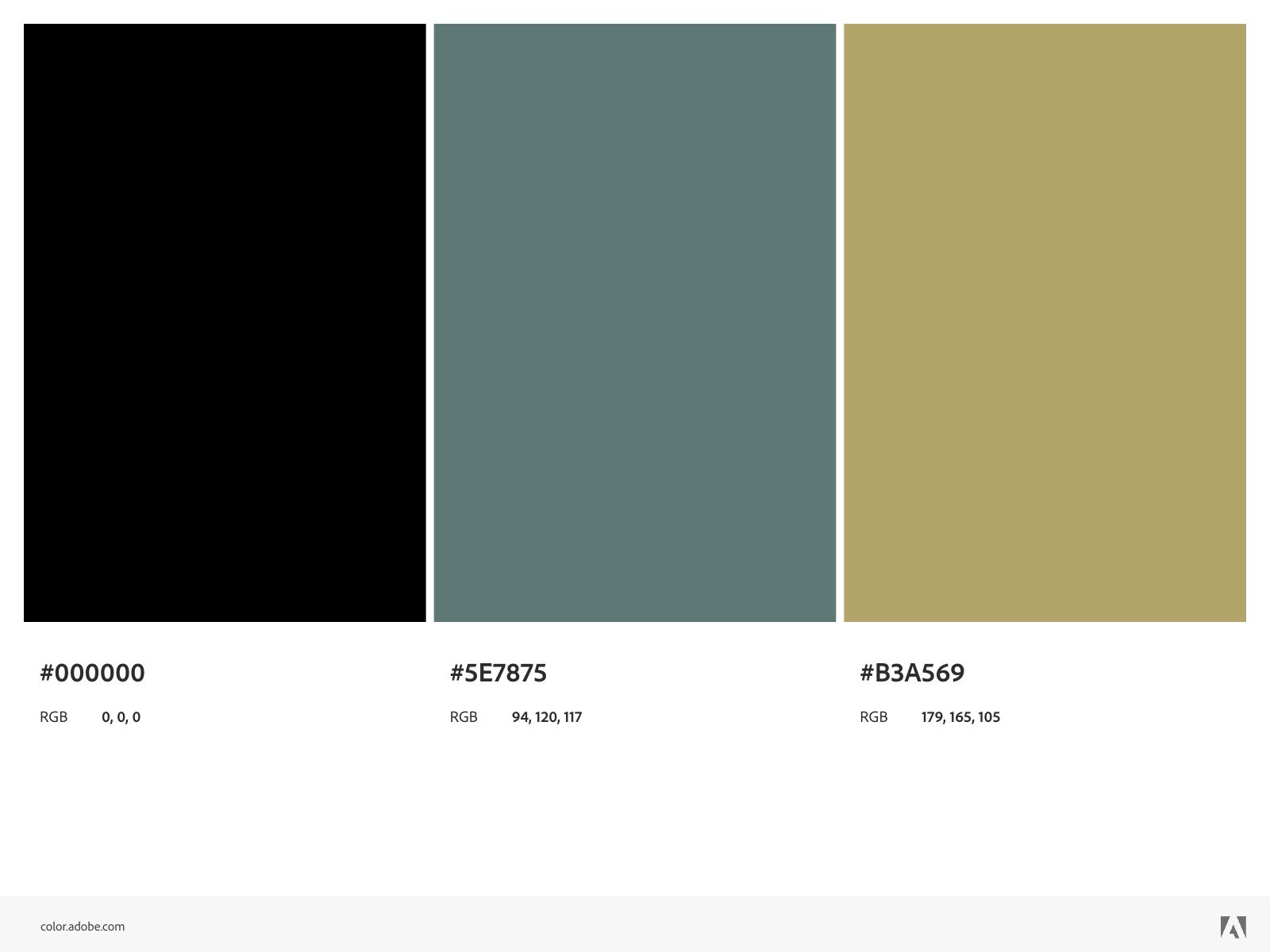
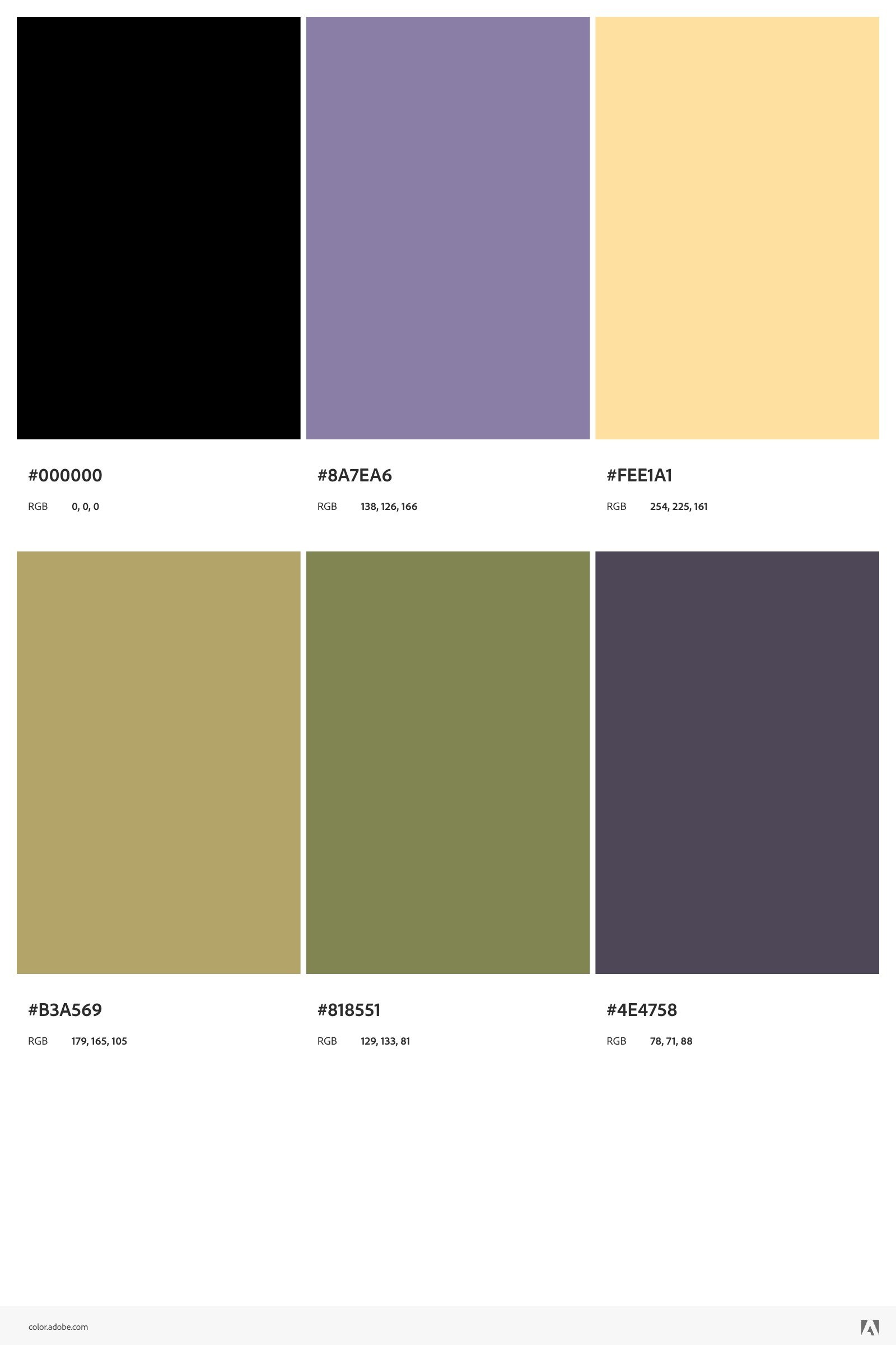
Whether you're new to block printing or a seasoned pro, choosing the perfect color palette can make or break your design. With over 20 colors at your fingertips, finding that just-right combination of hues can feel like a puzzle. Luckily, you don't have to tackle it alone! We've curated a few palettes from creators who've attended our workshops, each with its own unique flair. (The palette names give well-deserved credit to the creator.)
Noam
Nives
Ananya
Vimal
Ramta
Choosing a color palette isn't just about what looks good—it's about the story you want to tell through your art. Here are some things to keep in mind:
Consider the mood: Bright colors will add energy and excitement, while softer tones tend to feel more calm and serene.
Think about your subject matter: What are you printing? Organic forms often pair well with earthy tones, while geometric patterns thrive with bolder shades.
Experiment: Don’t be afraid to mix and match! Sometimes unexpected color combos yield the most beautiful results.
At Creatis, we love seeing how every creator interprets color differently. Our workshops are a space to explore and experiment with these curated palettes or craft your own. So whether you’re inspired by the natural world, vibrant cityscapes, or anything in between, there's a palette that will bring your vision to life.
